Обзор HTC Touch
06 сентября 2007
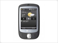
Новый курс производителей мобильных телефонов – сенсорные телефоны. Компания HTC решила использовать его по максимуму, особенно потому что она обладает необходимым солидным опытом в данной области и прогресс еще никому не мешал. HTC Touch – успешная часть данной стратегии и высоко оцениваемый мобильный телефон, который по сравнению со своим конкурентом – iPhone не привязан ни к одному из операторов, что делает радостными обычных пользователей. Этот мобильный телефон является превосходным совмещением высокотехнологических параметров и возможностей. HTC-Touch является также один из самых маленьких в своем классе при размерах 100x58x14 мм он весит всего лишь 112 гр.
The Display

The most attractive part of this device and the one which you’ll use more frequently is of course the large display. It is capable to display up to 65K colors at a resolution of 240x320 pixels. And giving the fact that it is almost keyless this is going to be your main control center also. The display is touch-sensitive and you can control everything from just a single touch. Regarding this fact we must mention that HTC involved here the new TouchFLO technology, which offers the user to use both the stylus and his figure to manage the navigation, however this solution needs a more express press on the display. This is not a problem especially when menu items have a larger sensitive surface then the displayed icons.
User Interface

The phone is based on the 6th version of Windows Mobile but it also integrates a user-friendly interface. If in most part of the menu we’ll find familiar design and applications, then the user interface reserved from HTC, is a pleasant experience as it involves simple and intuitive finger moves. The first change to notice is the home screen, which has the same structure but it includes new stuff and an improved design. Depending on which tab you choose to be preselected the top of the displayed will be showing Time, Application shortcuts or Weather conditions; above it the traditional start button is situated, below it – the scheduler headings are placed.
Navigation I
The new concept of the UI is based on a virtual triangle/cube, which holds three main sub-menus. To bring in the animated object, you need to swipe upwards across the display with your finger, and to do the opposite to hide it back. Once the miracle popped up you’re in front of the multimedia sub-menu. From here you may control the media-player and the photo-gallery. To get to other sub-menus, you need to swipe your finger horizontally and the 3D triangle will turn with the other side which houses a list with shortcuts to different applications. The next move will get you in front of a grid with multiple photos of your contacts. To access one of them you just need to tap and you get all the details on it. But you may view the contact list in a mode to which we are all used to. So when you open the contact list you can scroll throw them using side bars, or by imitating this moves on the screen, for slower or faster scrolling - the same as we found on iPhone. We can say the same thing regarding texting, as it features a vertical but not landscape keyboard, so that you’d better use the stylus in this case.
Navigation II
Other controls are physical/external. So below the display two answering keys are placed. Among them a 5 way controller helps to power the control over the phone. The volume controller is on the upper left side. On the opposite border the camera button helps to snap pictures really fast. Here we are able to distinguish a removable part which protects two slots: one for the SIM card and one for the Memory card respectively. The on/off button is on the top. The last feature we spotted is the USB slot, on the handset bottom.
Media
On the rear part, the 2MP camera is situated. The rounded metallic frame around it makes it look as a professional tool of a photographer. Photos and video are looking good but sometimes you’ll notice the lack of the autofocus function which was not included (maybe because of the sizes that the Touch model enjoys). The camera menu is easy to use and offers to apply some changes at the settings paragraph. Here you can change the photo resolution and the quality. You can also apply some standard effects but not too many though. However we shall mark the set of frames which you can use for photos. For the video option the most admirable key is the availability to record in the Mpeg4 format. This means that you can transfer files directly to your PC and play them instantly, without the need to decode them with a special software, or to encode to other formats in order to share them. Other options to send them to friends are the Bluetooth and the WiFi support. Which means you may benefit of the advantages a mobile internet connection offers. But HTC Touch makes sure you get all the comfort by interacting with a large range of devices. As for the end note we shall give all the credits to developers of this mobile phone as its integration level of applications deserves to be among the first and best in the industry; because not so many touch-based devices can boast it.
Источник: GSMPress


