One of the most popular Sony Ericsson series between music funs is the Walkman series. If we shall access the official site of the manufacturer and browse the phones under the “music phones” criteria, then Sony Ericsson W980i automatically moves to the head of the list. Yes, indeed, the W980i model is the last addition of this segment and represents the flagship of the Walkman series.
Sony Ericsson has come with some nice surprises, which are unexpected and uncharacteristic for the manufacturer till now, but which seems to become traditional hence further. Some of these surprises are the built in 8Gb memory, FM transmitter, visual effects and others – things that suit very well a musical phone. Of course, all the other usual Walkman features as SensMe, TrackID, Shake Control and the Walkman 3.0 player are present and they fulfill the musical side of this phone.
Well, it seems that is not only us who have appreciated the phone’s features – Sony Ericsson W980i had been nominated the best music phone of the 2008 by EISA. Let’s see why it deserves this title.
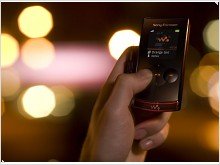
Sony Ericsson has decided to execute this model in a clamshell form factor, which was at first released only in Piano Black color. For the start, nothing unusual, but the designers have not let the things in that way – the phone literally become alive when the visual effects start and warm the atmosphere in the music beat. More on this topic later. What we wanted to highlight is that Sony Ericsson W980i is so joyful and vibrant when the music starts, as sober and straight when in standby. The orange visual effects are very well combined with the black gloss and they also correspond with the Walkman logo usual color.
Ok, let’s analyze the phone from edge to edge in closed condition. The material used for the body is plastic. The front side is executed from black varnished plastic, which looks very great until it is touched, the fingerprints are retained instantaneously. Here we have the external screen, TFT type with 262K colors and a 176x220 pixels resolution. In standby mode the screen is almost unnoticeable, not even the edges, leaving a clear glossy surface which continues down till the music player touch buttons – a total of 5 keys making a D-pad. The left/right keys are highlighted through their spherical form and even the icons of the D-pad is changing with the respective screen menu.
The external display has three modes. The first one served is the Walkman player from where you can access the audio library too. The external screen is also connected with the built in accelerometer, that’s why during music playing, the Walkman logo will turn in the opposite direction of the phone, while the animated background will follow the phone’s direction.
The second mode is the general info on the phone (network signal, battery, operator, time&date) and the third is the radio – we think no additional explanations needed here.
The upper half is ending with a transparent plastic edge, through which the Walkman logo (located on the down half) is seen. The same edge serves as the conducting medium for the light effects generated by LEDs. The light effects can be of orange color, when the music is on and of white color, in some points of menu. The orange light effects are active only when the Walkman 3.0 player is used and they reflect the low beats (bass) of the song, keeping the rhythm of the track.
On the right side of the phone, from up to bottom we can see the double volume key, the external screen changing mode button and the sliding key of blocking/unblocking the external touchpad. The last element is one of the stereo speakers. Logically, the second speaker is located on the left side in the same position, then comes the LED status indicator followed by the FastPort connector. It’s worth mentioning that with W980i is included a charger with a modified plug which permits to connect other accessories (e.g. the headset) while charging, a very practical and welcomed solution. The left upper corner has the eyelet for various accessories.
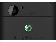
The rear side of the phone is executed from rubberized mat plastic, which gives a pleasant sensation at touch and holds the phone in the hand preventing accidental slips; it also do not gather so many fingerprints as the front side. Also here, on the upper area we see the 3.2 Mp digital camera with a light sensor next to it, which takes care of the image quality and sets the parameters depending on the ambient light. Less joyful is the lack of autofocus and flashlight.
In the bottom area is, of course, the battery lid, which is very good fixed, but it’s also comfortable to open. Under the hood it is a BST-38 Li-Polymer battery with 930 mAh.
When opened, the phone unveils the 2.2” main screen, TFT type, capable of 262K colors and a 240x320 pixels resolution – an usual screen that could have been at least a little bigger. Above the screen, it is the secondary VGA camera and next to it – the voice speaker. The two halves of the phone are joined in a not very esthetic way (the upper half overlaps the bottom when opened) from our point of view, and the phone cannot have a continuous design. Anyway, it depends on everybody’s taste.
On the bottom half we have the keyboard, naturally. Above the control keypad, in the right side, there is an ambient light sensor, which adjusts the screen brightness, saving the phone’s battery.
Keyboard and Management
The alphanumeric buttons of W980i are very good defined, of a satisfactory size and with more than enough space between them. That’s why no errors should occur at typing or dialing even for those with big fingers. Each button is spherical and the nest perimeter is highlighted through a chrome frame. The keys are at the same level as the phone surface, but there are no problems pressing them.
The control keypad consists of the D-pad and other six keys, organized in two groups sided with the D-pad. Each direction of the D-pad is a shortcut which can be chosen by the user. The other six buttons are two soft keys, the Accept/Reject call keys and the last two is the fast menu and the “C” key.
Also shortcuts are considered the Walkman button, which accesses the musical player and the On/Off button, which at a short press lists the available profiles and at a long press it switches off or on the phone.
We have to say that the control keypad of Sony Ericsson always was different from other phones, but not always it was the most comfortable one. At some models, e.g. W660i, the Accept/Reject call keys are missing and the user often is confused and needs time to get used to it. The fact that these two call keys were included in W980i is a good decision which grants more comfort to all the users, not only to those accustomed with Sony Ericsson.
Display, Menu and Applications
The image on the main screen is natural and clear. In the sunlight, the image does not heavily fade and even if from some angles the visibility is not the same, there are no problems in managing the phone. A little worse is the situation with the external screen, which due to the reflective surface, does not every time offer a clear view on the info. Anyway, this is an usual problem of the external screens, that’s why compared to other phones, the W980i is still better.
In what concerns the UI of Sony Ericsson W980i, well, it corresponds with the model’s class. It has the same good Sony Ericsson tradition and offers a wide set of possibilities. The desktop is standard with the upper status bar of network signal, battery, then comes the operator’s name on the center, date and time, and the three access point “Media”, “Menu” and “Contacts” – controlled by the soft keys and the Ok button from D-pad.
The main menu has 4 modes of displaying: a traditional 3x4 grid, a cycling spherical list, by one element on the screen and from theme. There are 5 preinstalled themes and among them the branded “Walkman” one. Various animations and effects are characteristic for each theme, satisfying most of the tastes, but for those who want more, there are a lot of themes available for free on the net ready to be installed.
The Fast menu button opens a window with four tabs which gather the most usual applications plus the browser, tasks from the organizer and the active applications. The first on the list is the Bluetooth, which is the second version and supports A2DP. The module is quite a performer through its high speed of data transfer and the additional option to control other devices compatible with such type of management.
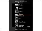
Of course, a special attention we shall pay to the Media center, which is accessed with the left soft key. It summarizes all the multimedia elements and features of W980i: Photo Gallery, Music, Video, Games, TV and Web feeds structured in a scheme of drop down lists, which is very comfortable and intuitive.
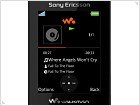
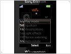
The Walkman 3.0 player is very well realized as it was expected. The equalizer has some standard presets, but is also allows making your own. When accessed, the equalizer takes the entire screen, being more comfortable and esthetic. The tracks are played showing the artist, the album and like effects can be the album cover or a chosen animation.
Walkman 3.0 makes use of the built in accelerometer through the ShakeControl system. If you want to change the next or the previous song, you can press the Walkman button and shake the phone to the right or to the left and like magic, the song will change. Though interesting, it’s quite weird to start shaking the phone in the middle of the street. Another inconvenience is the location of the walkman button, it can be accessed only opening the phone, it could have been better if the button were placed somewhere on the phone sides. However, the accelerometer works just fine and is responsive in all the applications where it was used. That’s why if you’ll place the phone in horizontal position, the music player will follow the phone almost instantaneously and will switch to landscape mode. The same thing happens when you are visualizing photos or watching videos.
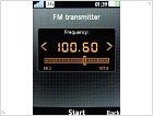
Among the standard options of the player, we can find the light effects which can be turned off/on and the new FM transmitter – which is an agreeable addition. This feature is really useful in many circumstances, making possible to play those 8Gb of music on all the devices with a FM receiver – in the car, at a party and many other situations. The tracks are not only played in a high quality environment (the phone works even better than some dedicated FM transmitters), but they also are indentified through the RDS system, displaying the name of the artist and album.
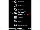
Another feature branded by Sony Ericsson is SenseMe – this application let you choose the songs depending on your mood, not by artist, album or other traditional criteria, a cool feature! However, SenseMe is the same as in the previous models, so, no additional comments required here. We shall remind you, that only the songs transferred through the PC Sync manager are indexed by SenseMe, so no tracks transferred on the phone as on a mass storage will be found in SenseMe.
The menu navigation as well as the running programs are not delayed or something similar, leaving a pleasant impression on the phone.
Digital Camera, Organizer and Entertainment
Well… in what concerning the digital camera – sure it was the element on which they saved money and not paid much attention. Without autofocus and flashlight, those 3.2 Mp do not worth as much as they could. Plus, the camera lenses are located in a very uncomfortable place, exactly where the finger grabs the phone.
Even so, the pictures are quite good (of course, in good light), but the level of details is not the greatest and the lack of autofocus allows the phone to take the pictures in a record time (about 1 sec). There are no abundant options, only these: Night mode, Self-timer, White balance ?i Color effects. The maximal resolution of the photo is 2048x1536 pixels.
The video clips are recorded in MPEG4 format with a QVGA resolution at 30fps. The quality is satisfactory.
The organizer is quite rich and it offers 10 elements plus File Manager and Video Call. Some of them are: Alarms, Calendar, Tasks, Notes, Synchronization, Timer, Stopwatch, Calculator and Code Memo. Among the applications we shall mention Music Mate, World Clock 3D and Walk Mate (counts the owner’s steps).
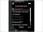
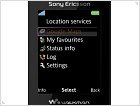
The Entertainment section is also good represented, the list begins with TrackID, a very useful feature when you hear a song you like and do not know the name or even the artist. Then comes Location services, which includes Google Maps and some complementary elements. Of course, when you try to open Google Maps, you are required to insert a GPS receiver. The next is the Games map with 3 preloaded games among which Need for Speed is also included. A trio of applications is VideoDJ, PhotoDJ and MusicDJ – as from their names, they allow the user to edit this kind of multimedia content. The other ones are Remote Control (via Bluetooth), Record sound and Demo Tour.
We also have noticed the Voice Control field from the settings menu. It includes Voice dialing, Voice answer, Magic word and some complementary options. Such kind of features becomes rare in the nowadays phones, but Sony Ericsson W980i has them all.
Conclusion
Sony Ericsson W980i has left us with positive impressions and it has demonstrated its top position of the Walkman series.
The main possible disappoint can be the poor digital camera and its weird location – things that may not draw so much attention on them if they were on some low end models, but they cannot be over sighted on this level.
In rest, the phone has proved that it is stuffed with features and innovative elements as the light effects and FM transmitter – things which cannot be found on any other ordinary phone and this is exactly what everybody is looking for – originality.
If we have to talk about the price, then Sony Ericsson W980i is in the same pool with such phones as Nokia N95-1, which is a powerful smartphone and has a well deserved popularity. Probably Sony Ericsson had in mind this principle “Each product has its own buyer” and it bets on the brand and music fans who will appreciate this last addition of the Walkman series.
Source: ®


