The MWC show, from the past February this year in Barcelona, became the starting point for Samsung U900 Soul. The model name was chosen in the honor of completion of the exclusive (second) series phones, The Ultra Edition, and the beginning of its third edition. In particular, the “Soul” acronym is formed from the the phrase "The Spirit Of Ultra". That sounds quite elegant, but indeed is corresponding to reality.
By its very concept, U900 Soul is not different from what Samsung is cultivating for already over 3 years: a flagship phone in the slide form-factor, the main idea of which is a good and qualitative implementation of the most functions that directly affect the price / quality balance. D500, D600, D900, U600/U700 - all these models had (the last ones still have) a deafening success. The first ones who will go for U900 Soul will be precisely those who agree with the last phrase, but now they want to see in their hands something new - the next stage of development.
The Exterior
Certainly, U900 Soul should be taken as a stylish solution. This is facilitated by its design, and cost. Now even the "metal housing", despite that more frequently it is used by manufacturers, are considered to be something exquisite. But this is not true. However, the "Ultra Spirit " is well defined.
U900 Soul has an imputable style: the model looks fresh, expensive and in a some kind of a monumental way. There are three color options, according to the official sources: black, silver, gold. We have received for tests the first one - Soul Gray. Judging by the images appeared on the network, other colors will be too.
The phone’s dimensions are 105 × 49,5 × 12,9 mm, weight - 113 g. The device excellently lies down in the hand; the materials are of high-quality and that is principle. The plastic is not glossy, but smooth. The metal is coated with lacquer. It does not spoil the impression, but rather on the contrary, it causes the feeling of completeness, "glazed". The varnish layer is designed to give shine and protect the metal from scratches.
The phone’s assembling - beyond all praise. It was well build, especially critical for sliders – the opening mechanism. In contrast with the same U600, the upper halve has no play. When you open the phone, the sliding mechanism at the very end slows down, which prevents the device to "bang".
The navigation area is rose up compared with the rest of the housing. The touch pad has a more thick cover, compared with the screen. Apparently, this solution is designed to reduce abrade of the main screen in contact with other surfaces.
The location of all elements is logical and habitually, but there is one unpleasant moment: double the double volume button and the interface connector (thin, RS232) are too close together. The construction design of any suitable (original) headset or adapter to 3.5 mm - the plug is realized in the "Г" form. One connected, it covers the volume key. Therefore, while listening to music you have to look the key with the finger under the wire.
But that's half of the problem. The connector cover is bound on the left (on the right we see the strap connector) and when is opened, it almost completely covers the key. Of course you can turn the stub perpendicularly to the housing, but in this situation, sooner or later it will be ripped off.
It’s interesting how the metal battery lid was mounted: on the inner side, it has a perpendicular pin, which is inserted in a special slot on the case. Until the construction will get loose, to remove the lid will be a little difficult.


The Screen
The main display represents an already proven solution - TFT-matrix with a 2.2" diagonal and resolution of 240 × 320 pixels, with the possibility of displaying 262 000 colors. The colors are bright, juicy and perfectly convey the picture. Because of the low toning picture, it severely fades in the sun, that negatively affects the text readability. To take some photos in such a day is also difficult: to see the settings or the focus correctness is not easy.
The touch screen is better from the technical point of view compared with the past solutions. Now, this is an OLED matrix with a resolution of 128 × 112 pixels and capable to display up to 65 536 colors. In the sun, this screen also severely fades.
For U900 Soul, the manufacturer did not save money on the idea implementation and introduced the opportunity to change the color of icons and arrows. On the other hand, this requires the possibility to create your own theme on the phone, but about this later.


The Navigation
Now, perhaps, this is the most important moment in the issue of buying U900 Soul – the ergonomics. With the hand on the heart, every second person will say that the sensitive control by its nature is an inconvenient thing, but beautiful.
Instead of the navigation button, the phone was equipped with a DaCP ™ touch screen. In the LG KF600 review we have pointed out that exactly this feature the manufacturer is emphasizing. According to LG, the InteractPad (the touchpad area of KF600) with its contextual virtual buttons that are changing depending on the tasks, have already arrived to replace the mechanical navigation buttons.
At Samsung do not agree with this, so, their concept of management, Magic Touch, also includes mechanics: soft keys and accept/reject keys. Of course, under way or in transport, it’s easier to work with conventional keys. For this reason, at some points, the U900 Soul ergonomics does not raise any questions. But, unfortunately, this tandem is still inconvenient. In LG KF600 all navigation is carried out only through the touch keys. In U900 Soul, sensitive is only the navigation unit. In other words, such mistakes as "gently touching the mechanics and confidently pushing on the sensor" are quite often, which is very inconvenient. It’s hard to get used to it.
Otherwise, the very concept is developed well and deserves commendation. In LG KF600 after the entrance to the "menu" usually can be seen the "OK", "Back" keys and direction arrows. In more complicated sublevels (the list of messages, for example) there are two arrows (up and down or right and left), the "Back" key remains always (with few exceptions). There, you'll see "View" and "Delete" as the most popular keys, while the other functions will be hidden under the special contextual button.
In U900 Soul is not a specific system or principle. On the screen appear just the most popular keys. The touch screen allows you to create icons for each menu and, when necessary, to change them.
To compare U900 Soul with LG KF600 it’s possible only by one parameter - the touch control implementation. In addition, both models were introduced and released at the same time. It’s just interesting to see different solutions of the same challenge, particularly at this stage of technology development in general.
For ease of use, DaCP ™ provides the multi-touch system a feedback with sound, visual and tactile signals. When clicking, the icons becomes bigger, the phone vibrates slightly and produces a sound similar to click. This system of feedback is designed not only to visually bring the virtual keys to reality, but also to ensure convenience and maximum precision.
When you’re thinking to buy the U900 Soul, is vital to experience for yourself the touch pad control. Otherwise you will be disappointed.
The usual keyboard is convenient; the keys have a middle course and white backlight. The buttons are made of a metal sheet, this is practical and well-known construction.


Inside the phone
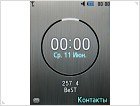
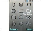
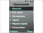
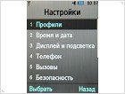
The main menu represents a matrix of 3 × 4, which is standard for the latest models of Samsung. The submenus are grouped in horizontal lists, which pop-up.
As standard menu themes we see three. They are interesting, beautiful and stylized. If you have the desire, you can practice and create your own theme. There are many settings, which will let you go away from the standard for a while.
Otherwise there are no serious differences - all is standard and typical for the last generation of Samsung phones.
The phone book simultaneously displays the phone’s contacts and the ones from the SIM-card. There is a quick search, but only by name, this one being the first field. The second field is the surname. The contact is displayed by two fields – name and surname. In addition to phone numbers you can write the e-mail address, small text note and the address. The memory can store up to 1000 contacts with all fields filled up with numbers and data.
The phone can store up to 500 messages, the EMS standard is supported. When creating the messages you can choose the type - SMS or MMS. The maximum size of an outgoing MMS is 300 KB.
In U900 Soul is realized a useful function of sending SOS-messages. You can add up to 5 numbers, to which will be sent a special message: "I am in emergency. Please help me". The SOS signals can be sent after a fourfold pressing the volume button. After the SOS is sent, the calls from the submitted numbers will be taken automatically.
The Java productivity compared with the same Samsung U600 is not increased.
The FM-radio work is standard: 20 presets, mono / stereo switch, RDS is present. There is still not possible to name the saved stations - in the list you'll see only the frequency.
The phone has a built-in audio player with a digital audio amplifier, ICEpower, from Bang & Olufsen. The quality of play pleasantly surprised. But you can only hear it when using an 3.5 mm adapter, as the standard headset does not convey all the beauty. U900 Soul is quite suitable for listening to music: you can create playlists, repeat and mixing is supported, there are equalizer settings (9 presets without the "manual" one), the player can be minimized.
The communication opportunities of U900 Soul are at a good level. There is a version 2.0c Bluetooth with EDR support, as well as a number of profiles: A2DP, Basic Printing, Dial Up Networking, Dual Profile Bluetooth, File Transfer, Handsfree, Headset, Object Push, Serial Port. There is also possible to transfer the stereo sound simultaneously to two Bluetooth-headset.
When connected via USB (2.0), you can select one of the three modes: Samsung PC Studio, Mass Storage and MediaPlayer (the last one gives the possibility to synchronize with the media-bibliotheca), while the device is charging. In the USB Mass Storage mode, data transfer speed is about 900 Kb / sec.
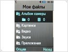
The phone has 120 MB of built-in memory, which for the first time should be sufficient. The MicroSD card slot works just fine with a 2 GB volume.






The Digital Camera
U900 Soul has a decent, by today's standards, 5 Mp digital camera. It is supported five types of size (maximum - 2560 × 1920) and three types of compression. The user has a burst mode available and also can use frames.
As additional features there are various effects: Grey, Sepia, Negative, Antique, Water Colour. White balance settings, choice of sensor sensitivity ISO (50-400), 10 seconds timer are also available. Antishake feature works in very few cases. Macro mode works ok only if it’s enough light.
The obtained images’ quality is great. In daylight conditions, the compression and noise are practically invisible. The other side of the coin - the low noise is due to the low light sensitivity, but this is resulting in "dark" photos when the light is not sufficient, even if the "Night mode" option is activated.



The Battery
In the U900 Soul is installed a Li-ion-battery with the capacity of 880 mAh. The average work time is about two days (without the active use of multimedia features). 3 hours is the limit for talk time. With the multimedia player turned on through the bluetooth set, the phone works about 11 hours. Frequent listening to music and active use of other functions would require a daily charge.
Conclusions
The Samsung Company has again presented a qualitative handset. Despite the fairly high cost (at the moment is about 450 Eur), arguments for buying U900 Soul are found.
The handset should be taken as an image model. It pleased our eyes the phone’s assembly and the critical sliding mechanism for this form factor, excellent design and communications opportunities.
A controversial point, the camera should be considered. On the one hand, in good light the phone can take high-quality images, on the other – it shoots poorly in the dark. We also are not pleased with the work time. However, you can live with that.
Even a minimal list of strengths and weaknesses shows that U900 Soul is still a good solution. The model makes a good impression and looks like a developed device, and, perhaps, this is the most important for the flagship line.
Source: GSMpress ®


